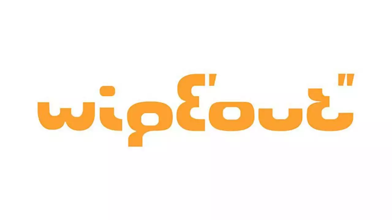
This PlayStation logo secret is a retro treat.
For those who haven't had the joy of playing Psygnosis's original Wipeout, it was a futuristic racing game originally released as a European launch title for the Sony PlayStation, as well as for PCs, all the way back in 1995. Players competed in an anti-gravity racing league set in the year 2052, complete with music from the likes of Orbital and the Chemical Brothers .
The original Wipeout logo is made entirely from a cut-up number 8 in the Eurostile typeface. The pieces are all aligned differently to spell out the name of the game . Even the dot on the top of the 'i' is formed from the negative space in the number 8 in Aldo Novarese's original type. Here's something I've always enjoyed about the original WipEout logo: it's made of the chopped up Eurostile letterform for the number 8.#WipEout #typography pic.twitter.com/QAxSfnGafZIt’s a simple idea, and it becomes very clear when Skuthorpe breaks it down above. Coupled with the rest of the game's graphic design, it was effective and cohesive. But a lot of people never made the connection.
